B2B SaaS · Marketing Automation · Onboarding · Complex Workflows
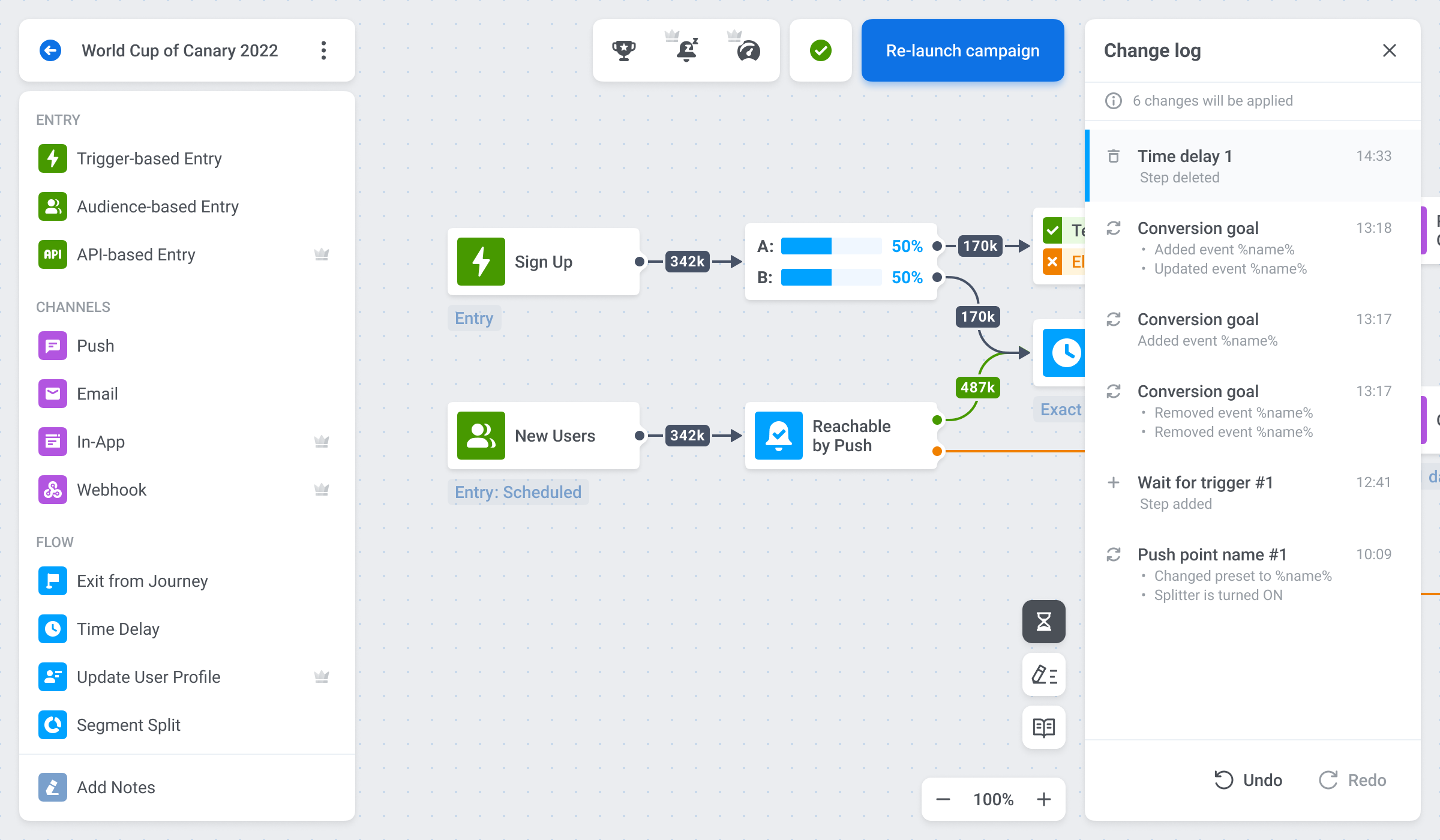
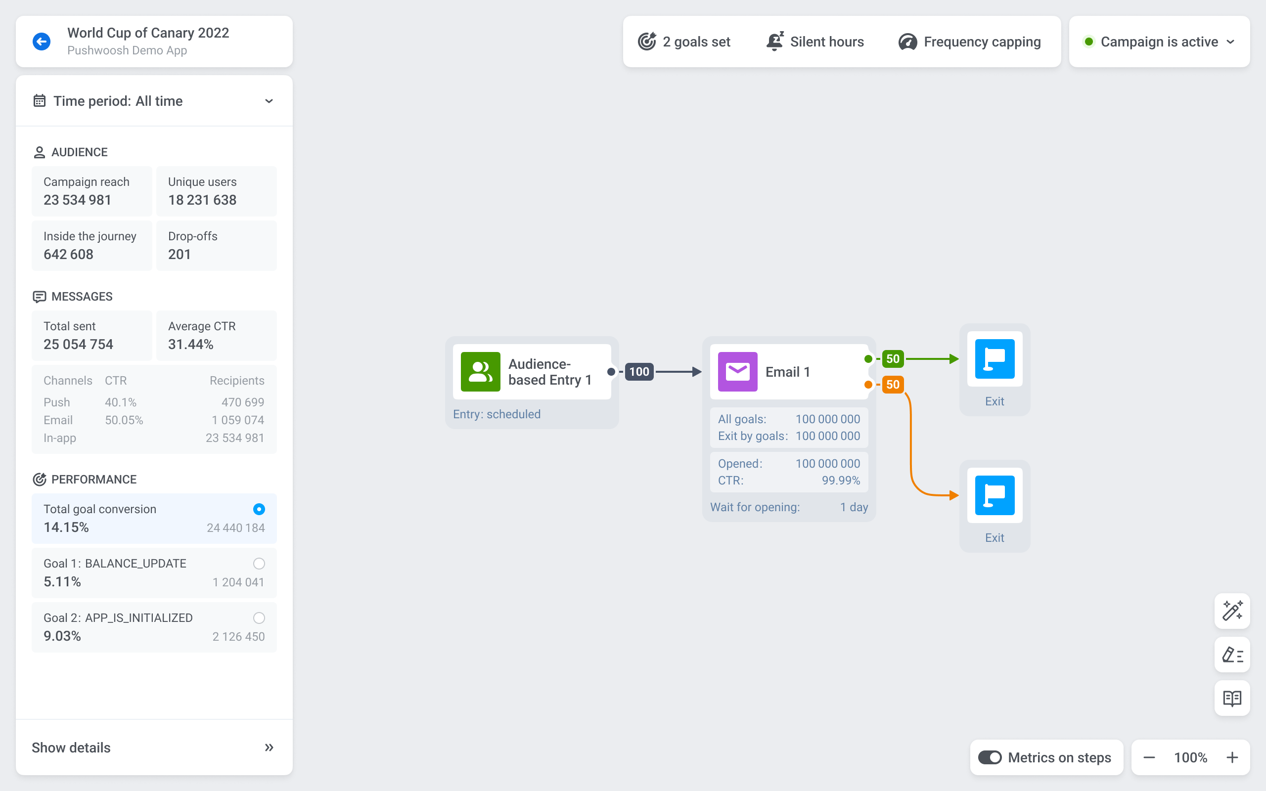
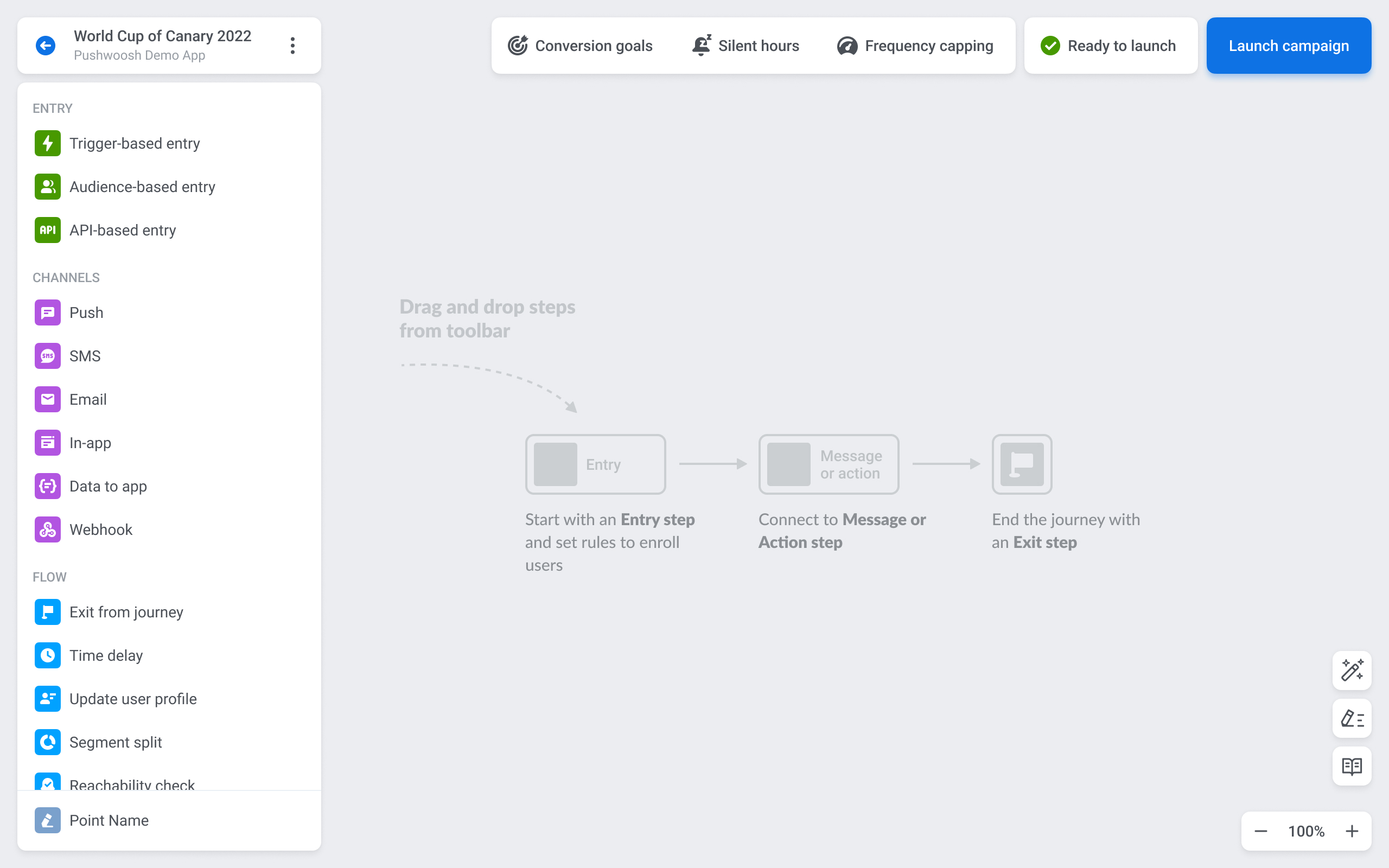
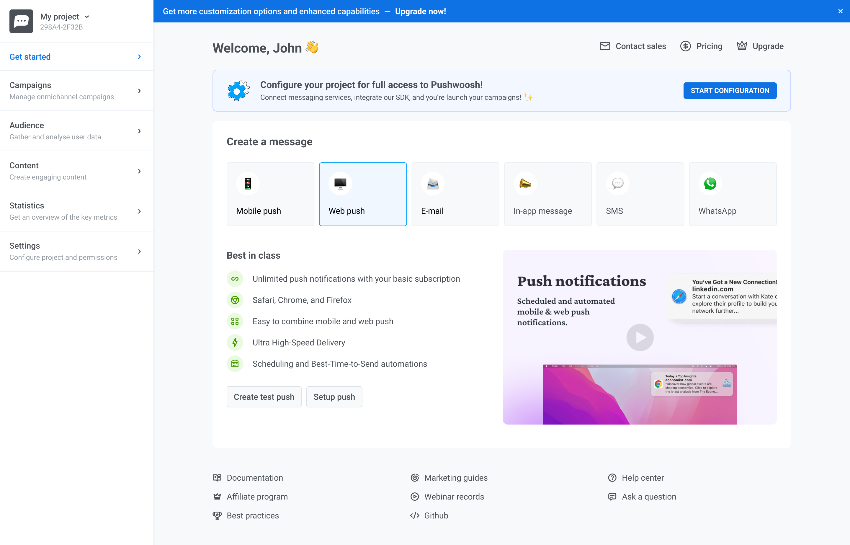
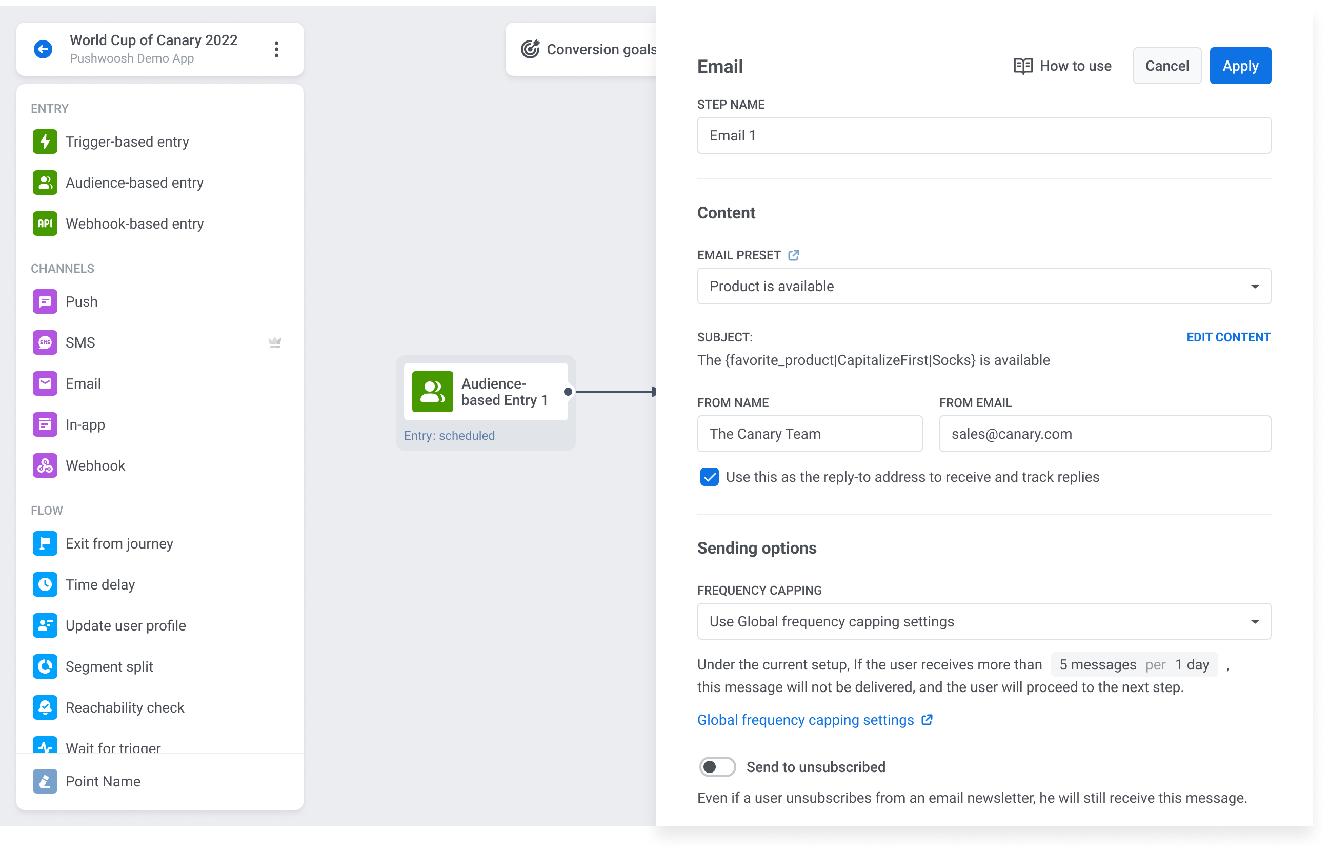
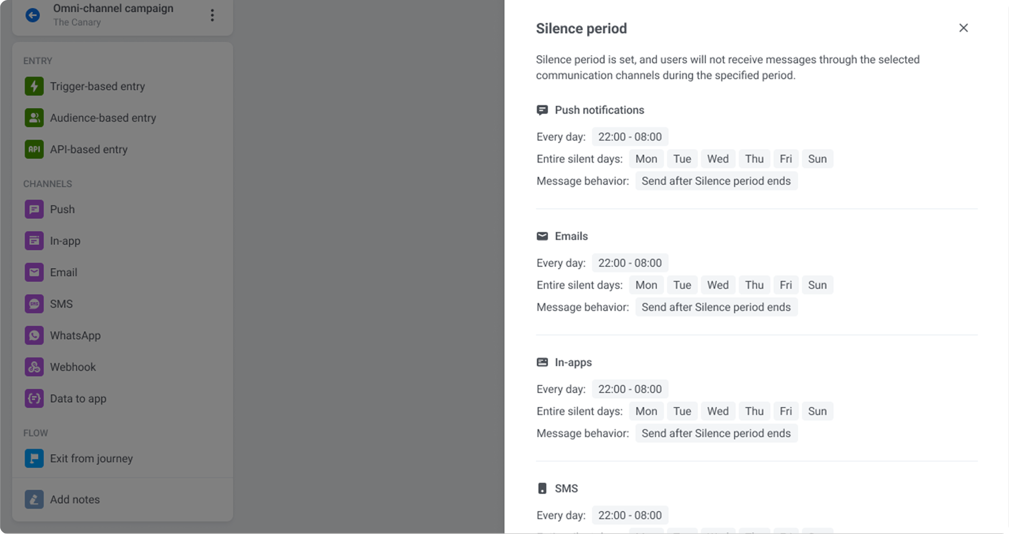
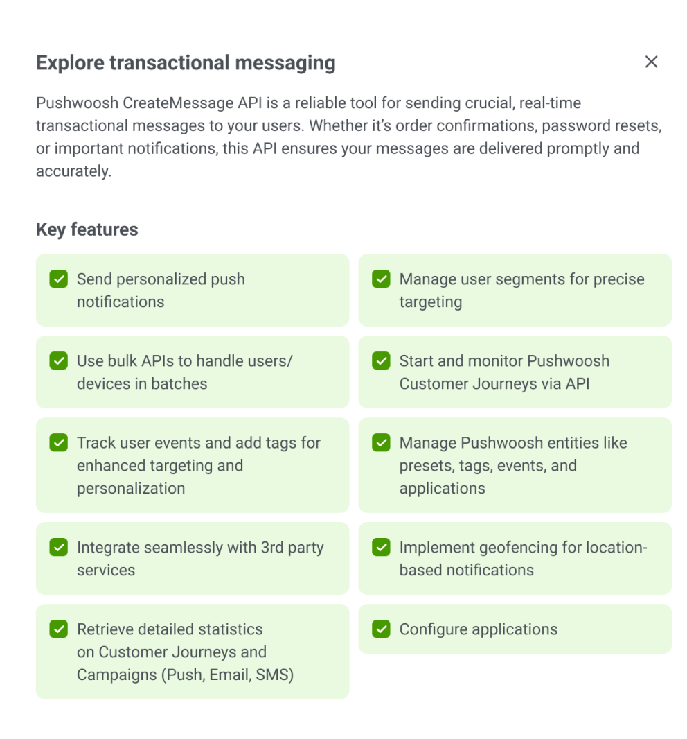
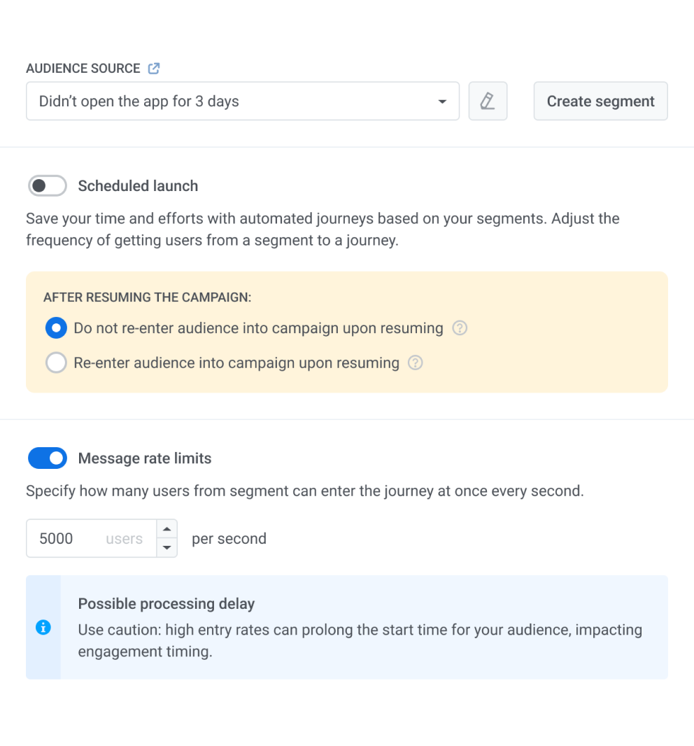
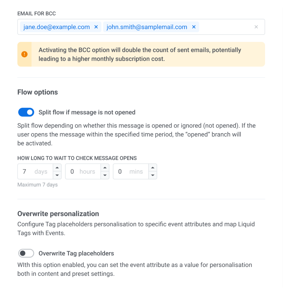
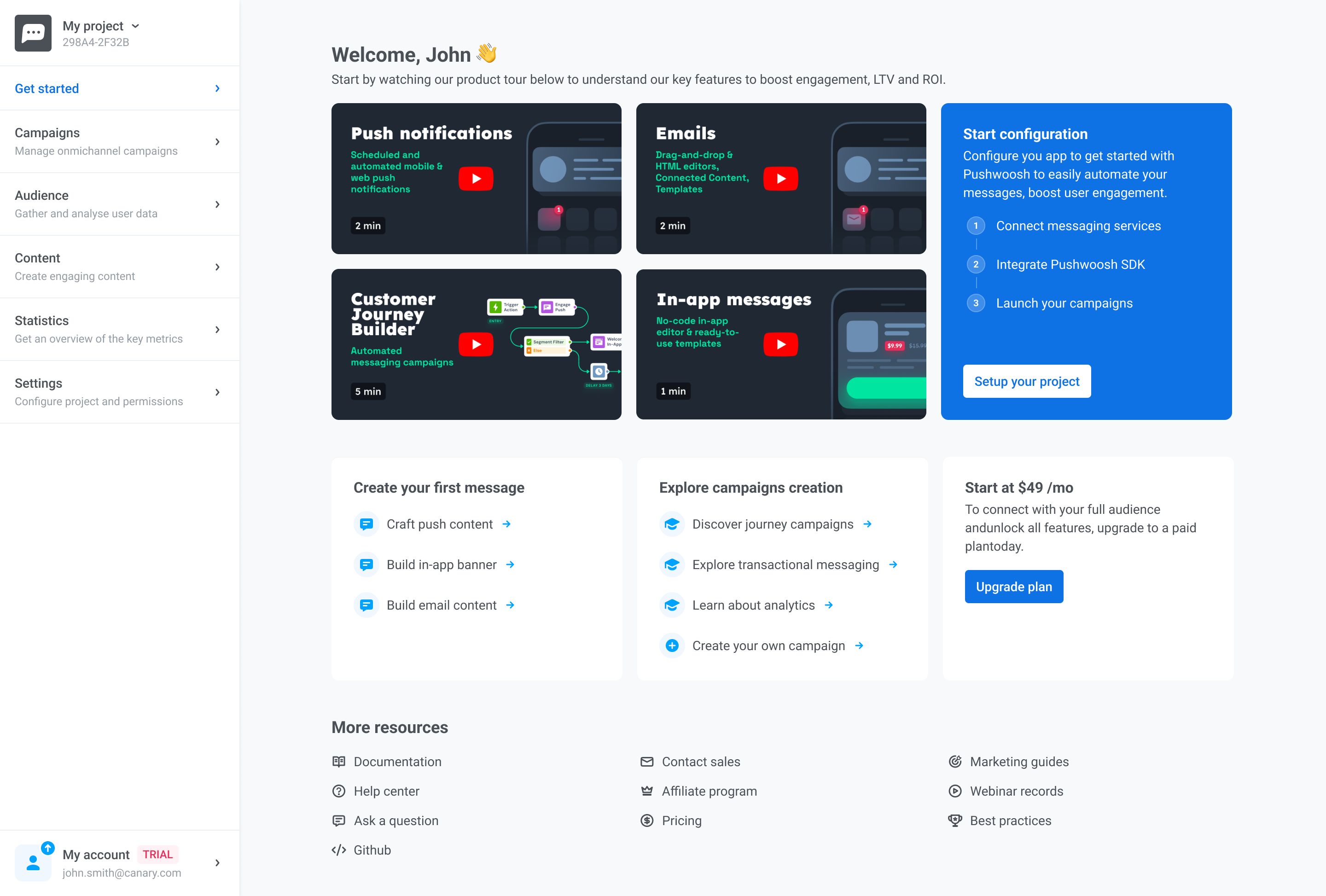
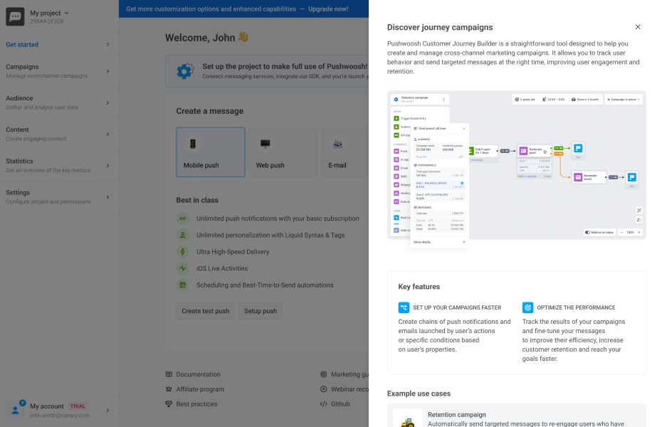
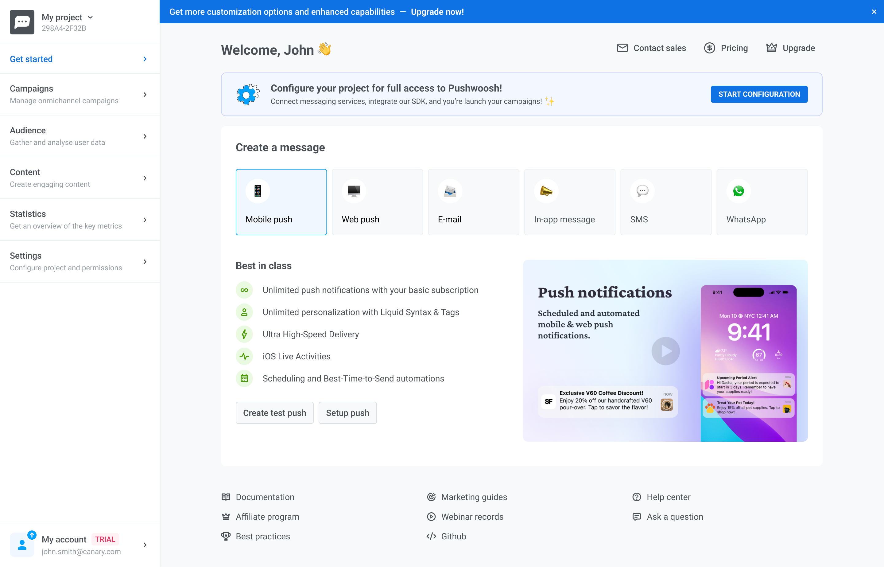
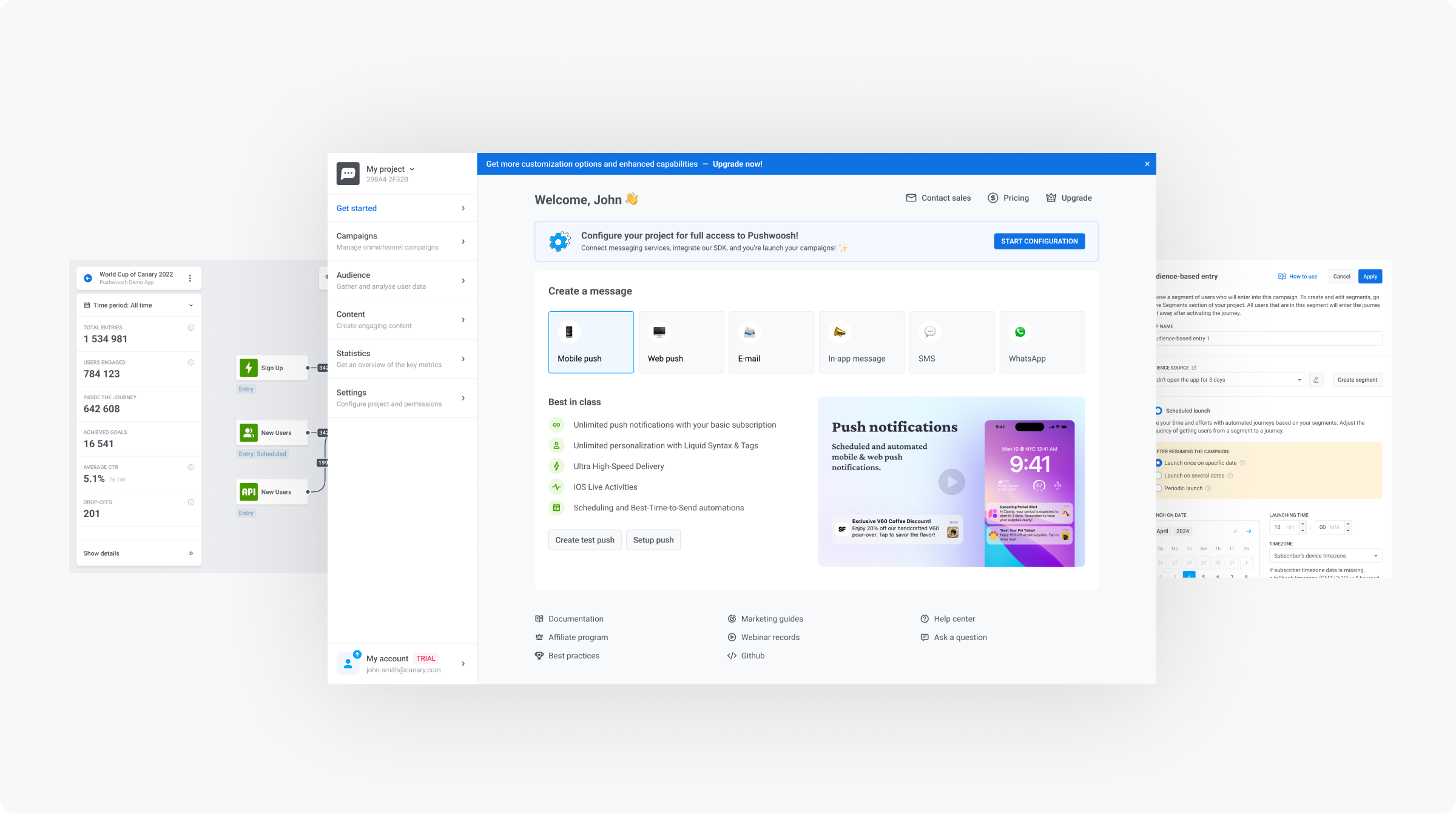
Pushwoosh is powerful — multi-channel campaigns, automation rules, segmentation, real-time data. But that power came with friction. New users struggled to reach first value before giving up. The challenge was making a complex product easier to enter, without making it simpler than it needed to be.
Product Context
Pushwoosh enables product and marketing teams to build multi-channel communication flows — push notifications, email, in-app messages, WhatsApp — with complex segmentation logic, automation rules, and branching conditions.
The product serves teams with high technical expectations. Advanced users need the full feature set. But the first-time experience determines whether those users ever reach that depth — or churn before they get there.
Core workflow: multi-channel automation builder with conditions, delays, and branching logic.
Product Screens
The Challenge
New users arrived with real intent — to set up a campaign, connect a channel, send their first message. Instead of a clear path, they found an environment that assumed too much context too soon. Cognitive load was high, next steps were unclear, and most users turned to support before completing basic setup.
The original onboarding presented too many options too early, without clear guidance on what mattered first.
Design Focus
The core strategy was progressive: don't simplify the product, but simplify the path into it. Each design decision was made to reduce early friction while preserving the flexibility advanced teams depend on.
The original onboarding tried to do too much at once — channel selection, SDK setup, campaign creation, and notification preview all competed for attention on arrival. I restructured the first-run experience around a single primary action at each step, deferring secondary decisions until they were actually needed.
Users moved through setup with more confidence and significantly less time spent re-reading or asking for help.
A single clear CTA helped users understand where to start and reduced decision fatigue at the beginning of onboarding.
Journey campaigns were powerful, but too complex to introduce on the first screen. I used contextual guidance to explain what they are, when they are useful, and how they extend a basic campaign into a more advanced communication flow.
This kept onboarding focused while still making the product’s deeper capabilities visible at the right moment.
Contextual guidance introduced journey campaigns as an advanced option after users understood the basic campaign setup.
Many new users entered Pushwoosh expecting a push notification tool, while the product’s broader value — email, in-app messages, web push, SMS, and WhatsApp — stayed hidden until later in the experience.
I redesigned the message creation step to surface all available channels upfront, helping users understand the platform’s full communication scope before they started building their first campaign.
Showing all channels upfront made the product’s multi-channel value clear before users created their first campaign.
After users understood the basic setup and available channels, the next step was helping them move into campaign creation. The onboarding needed to connect configuration with a meaningful product action, not leave users wondering what to do next.
I made the path from setup to campaign creation more explicit, so users could continue from learning the product to actually building their first communication flow.
A clearer transition from setup to campaign creation helped users move closer to first value.
Result
The final experience guided users through setup with clearer priorities, visible progress, and contextual guidance. Instead of asking users to understand the full product upfront, the interface helped them move step by step toward their first campaign.
The redesigned onboarding gave users a clearer path from setup to first campaign creation.
Process
Results
Reflection
This project wasn't about making Pushwoosh simpler. It was about making the complexity easier to enter, understand, and use at the right moment. The strongest design decision was to guide users gradually — giving them a clear path to first value before exposing the full depth of the product. That tension, between power and accessibility, is at the core of every good B2B product design challenge.