B2B SaaS · Performance Marketing · Statistics Workflow · Data-heavy Interfaces

Improving the Statistics workflow

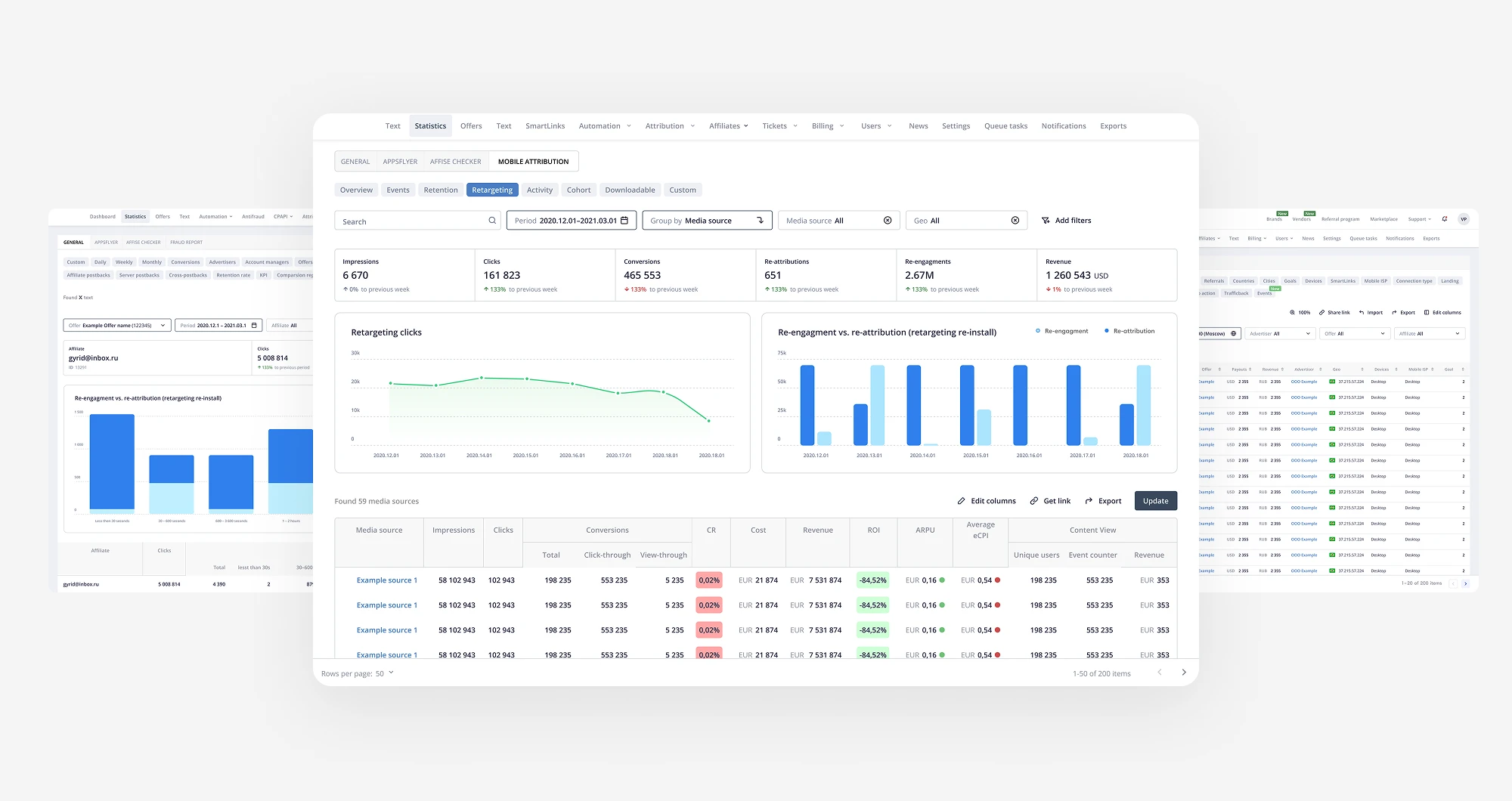
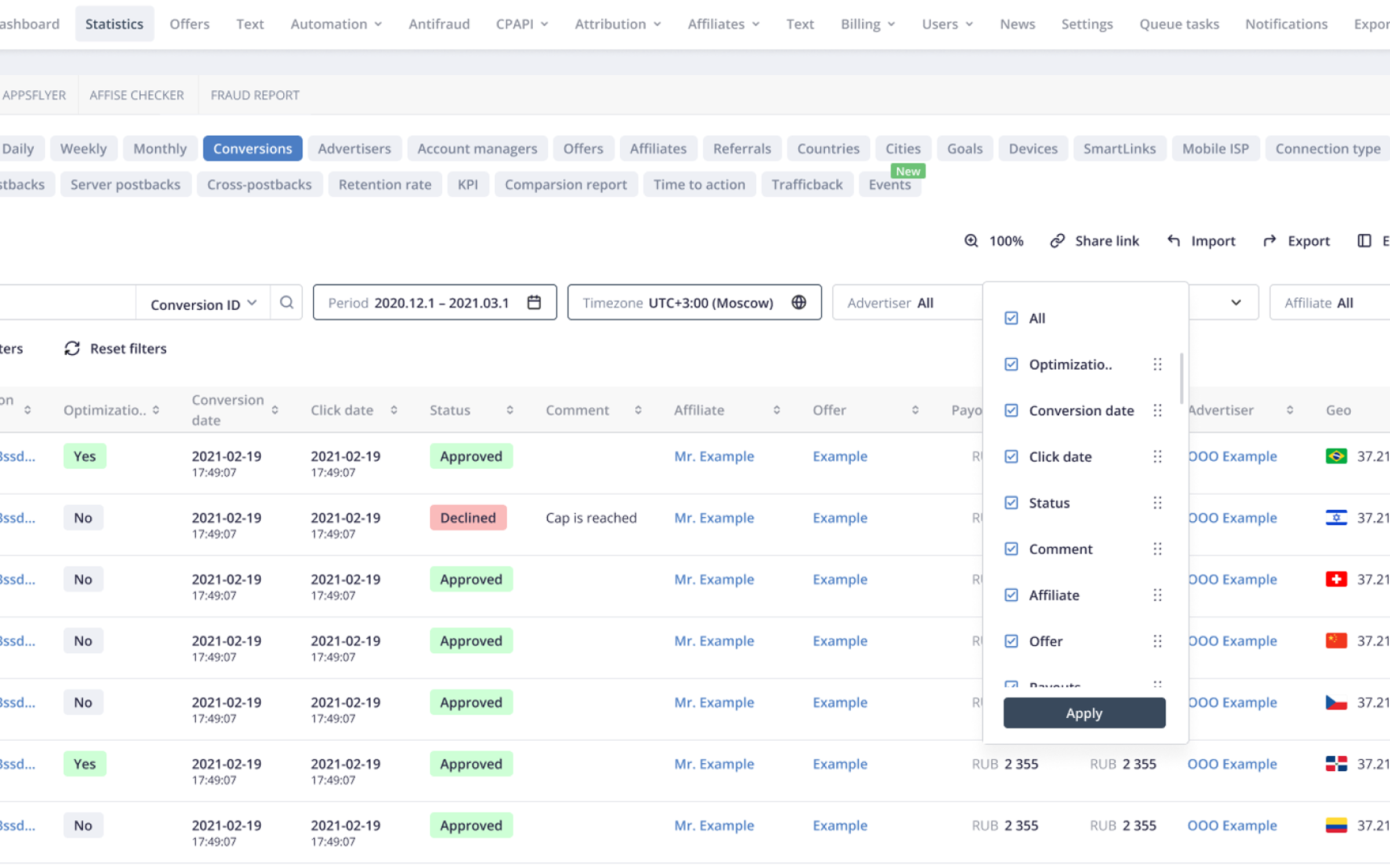
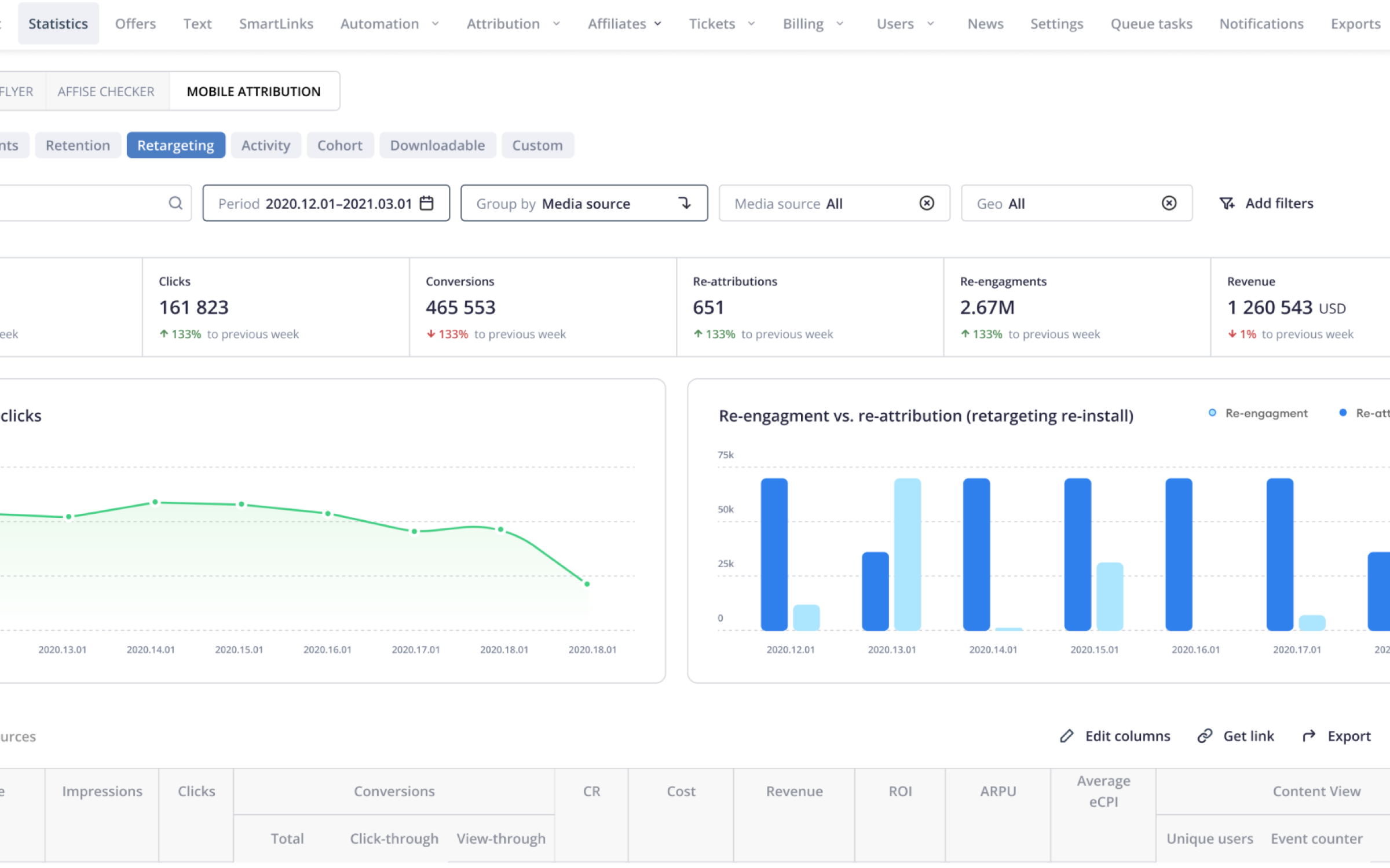
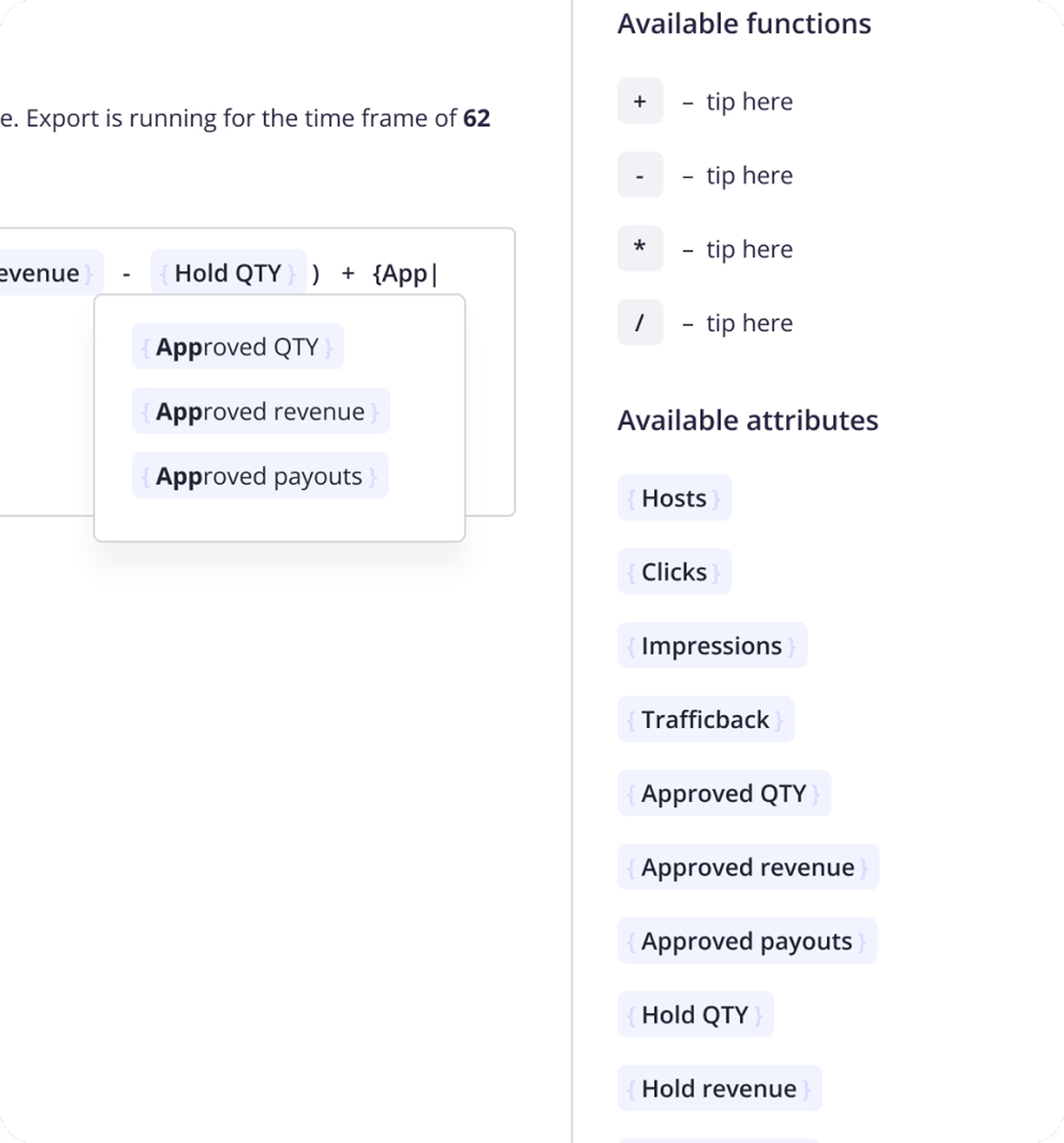
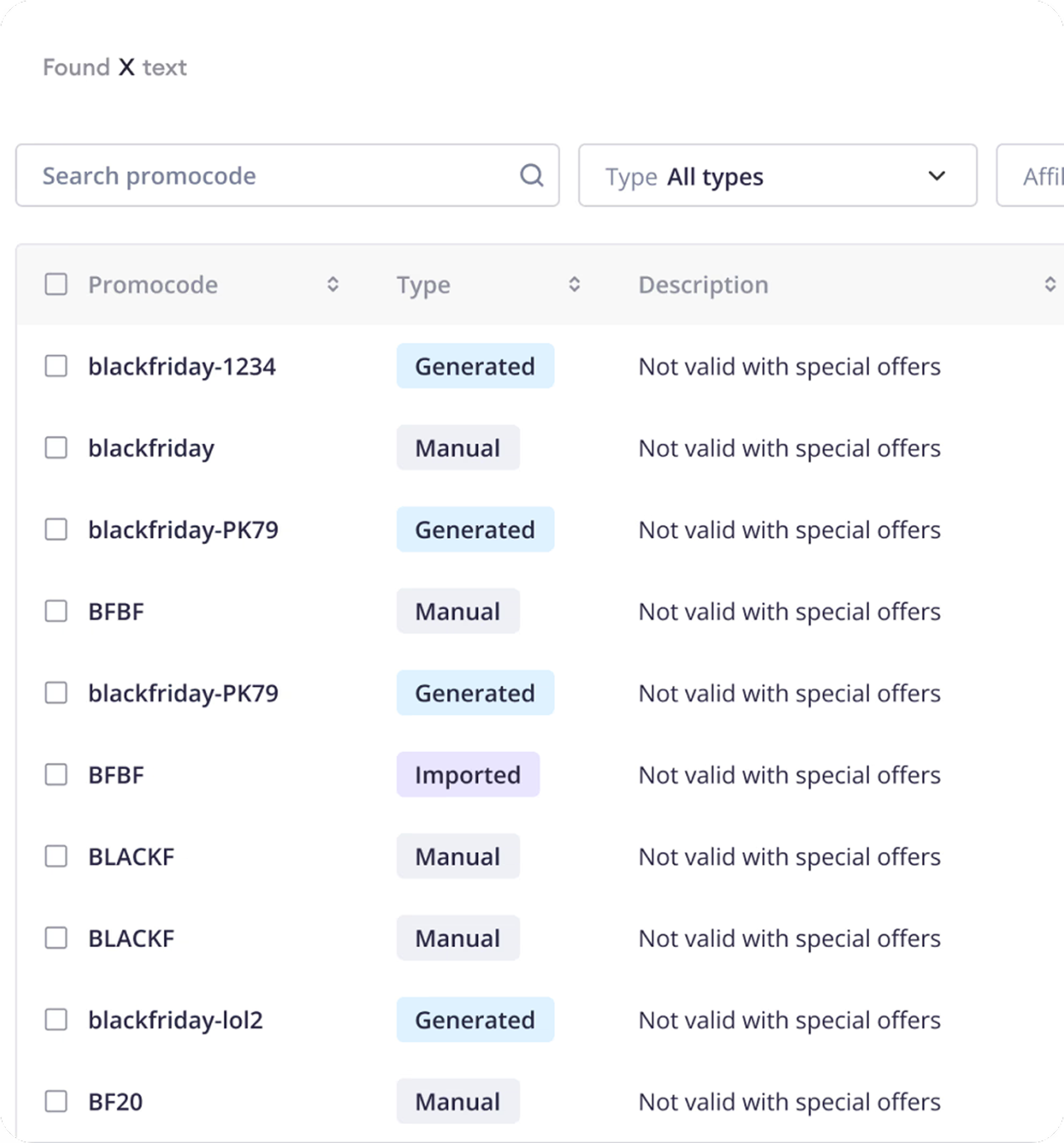
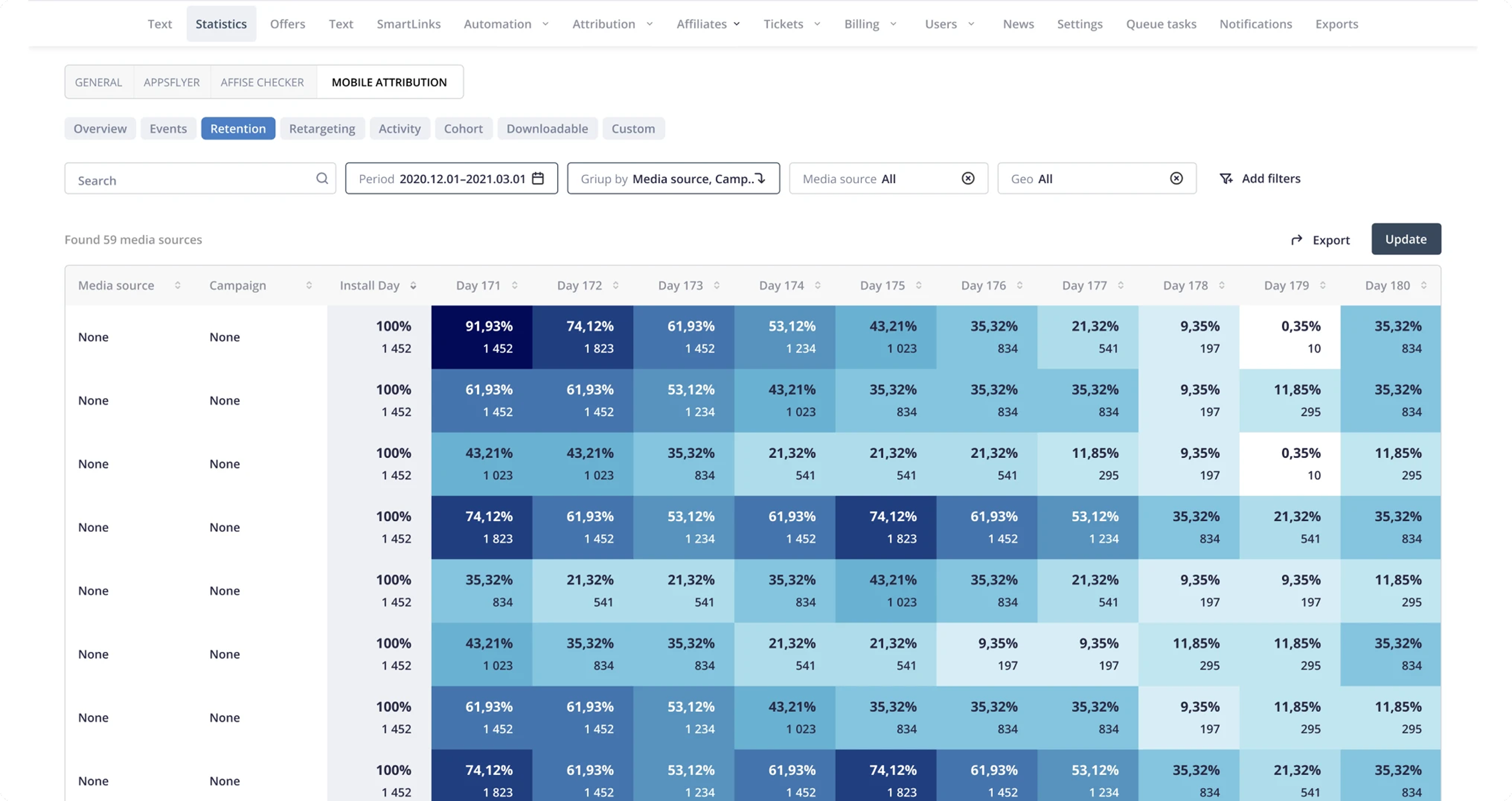
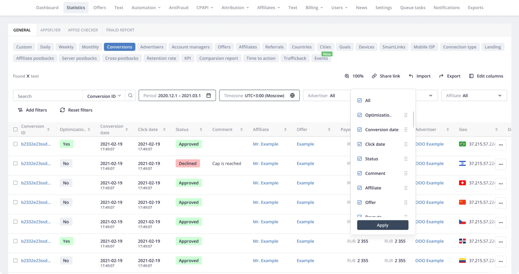
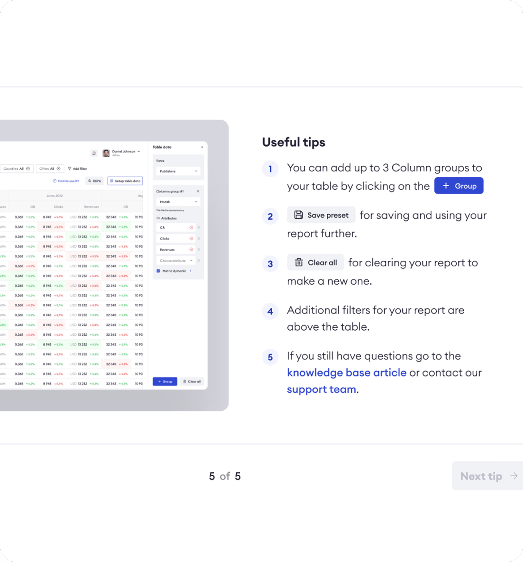
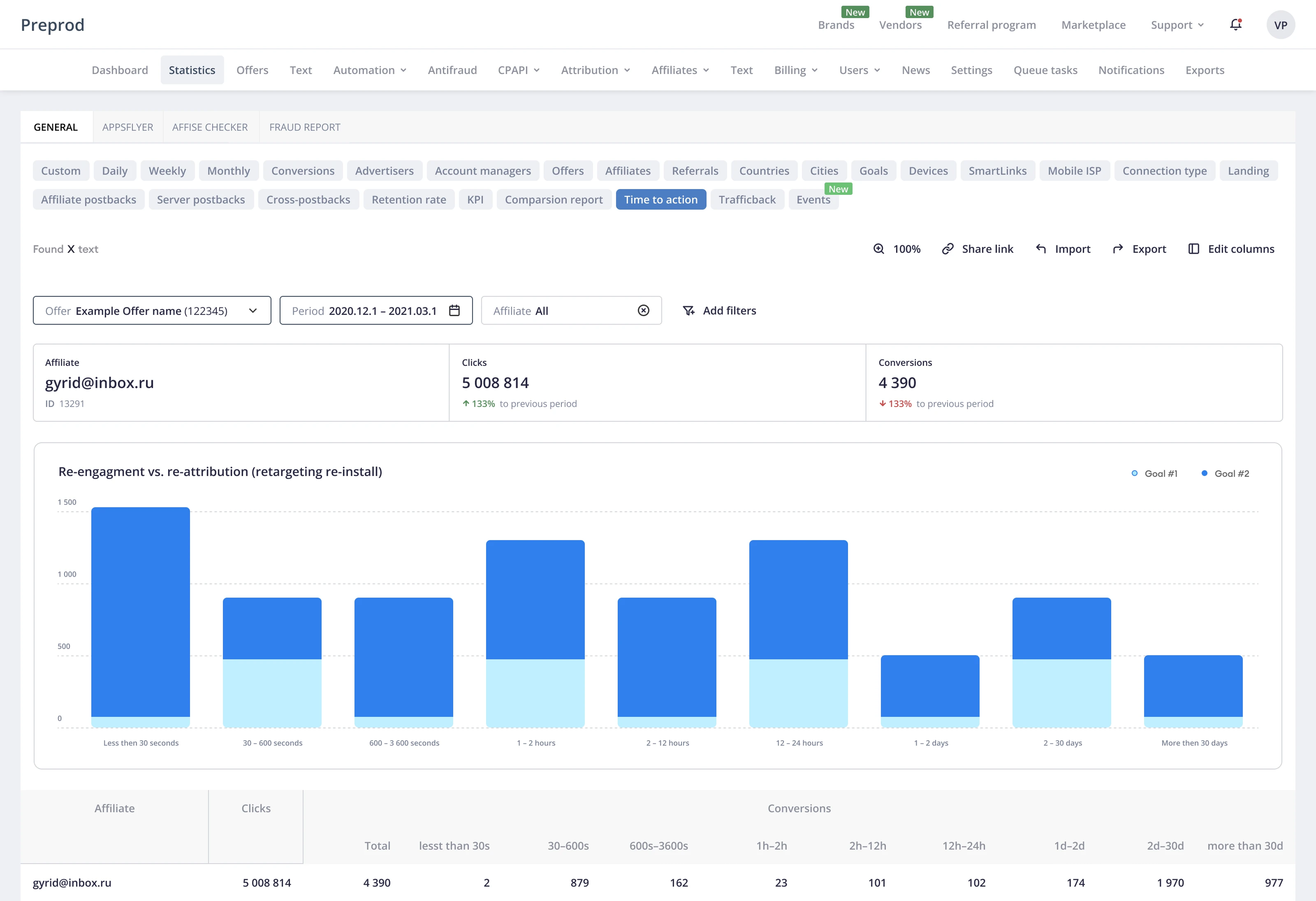
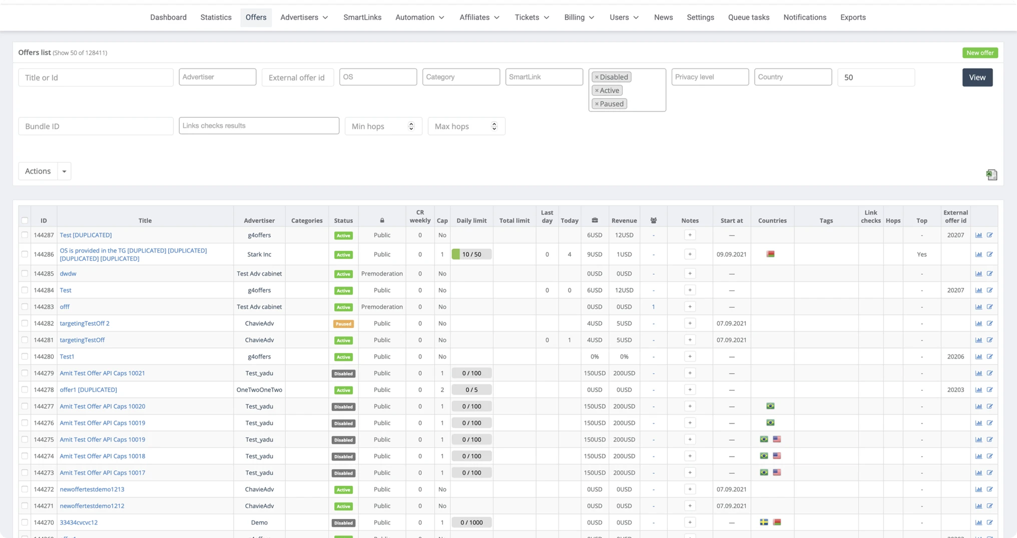
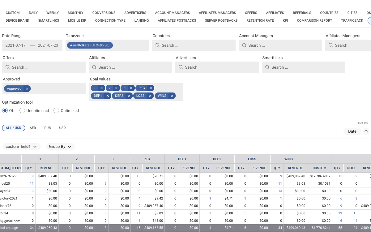
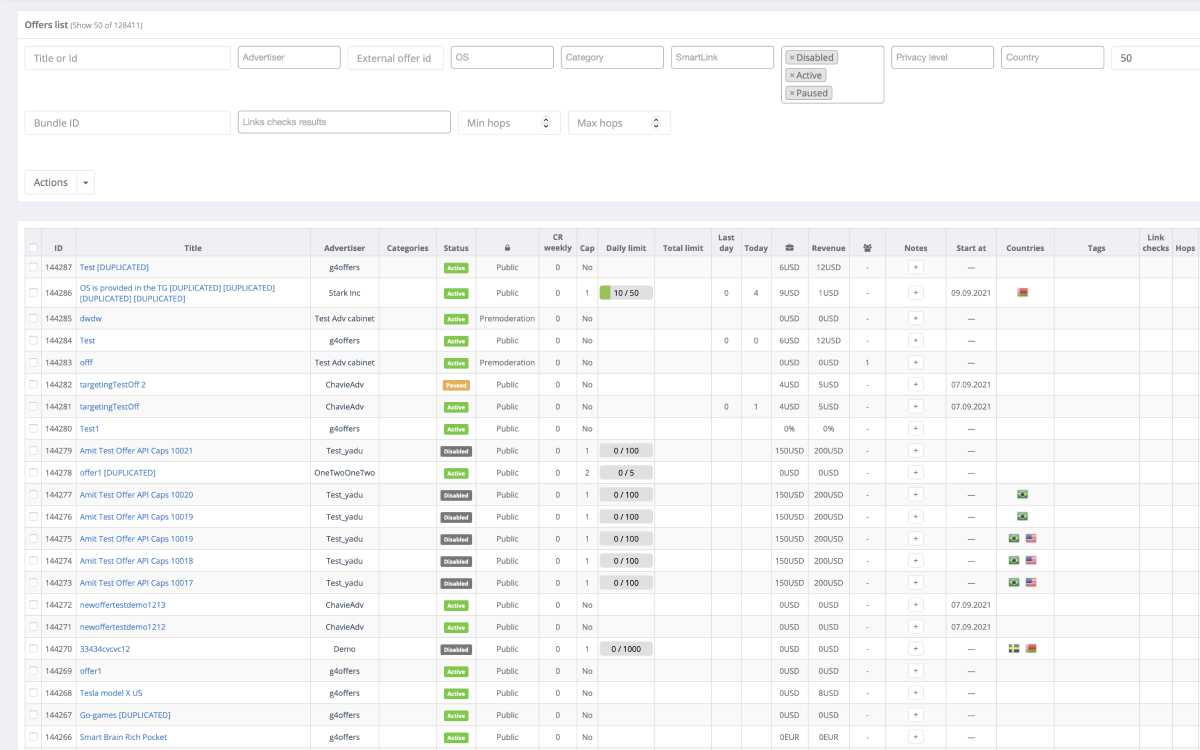
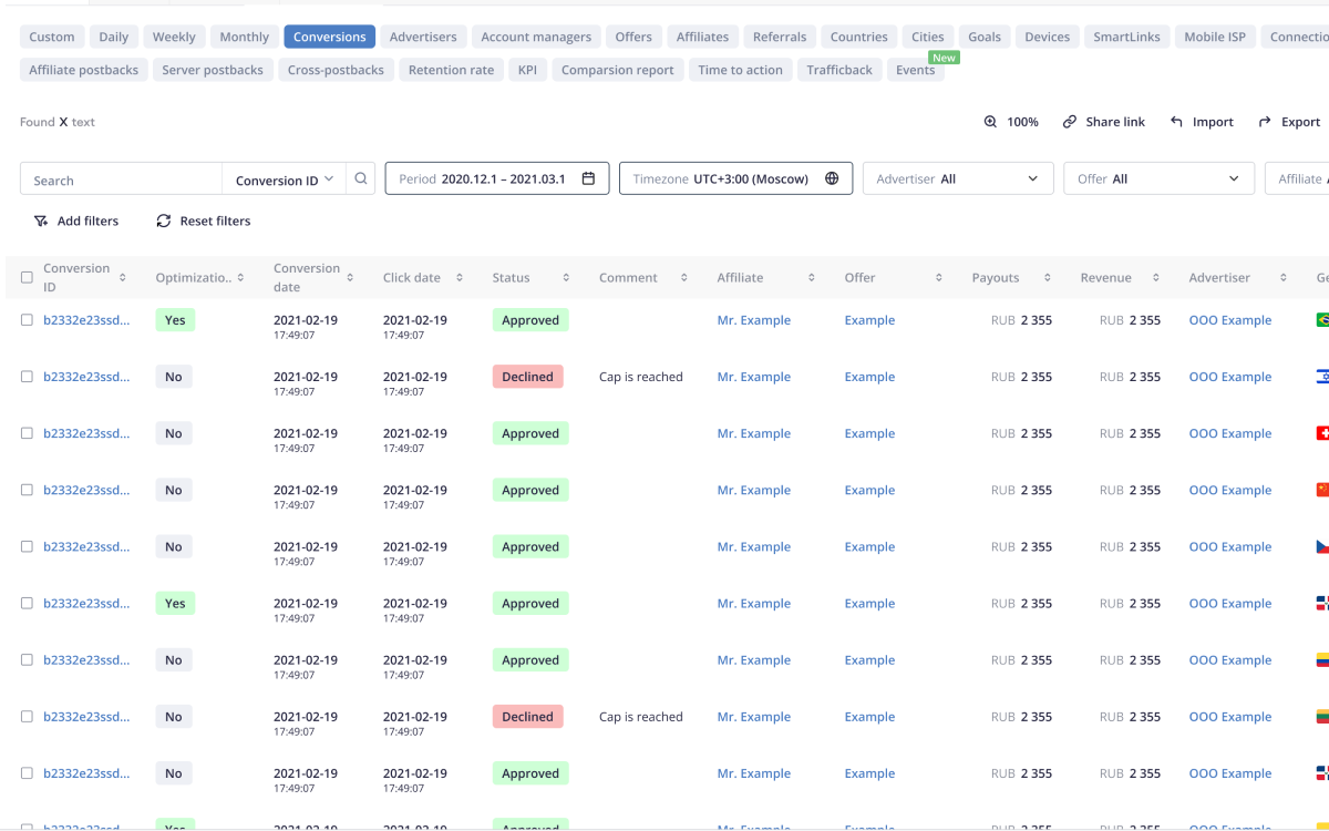
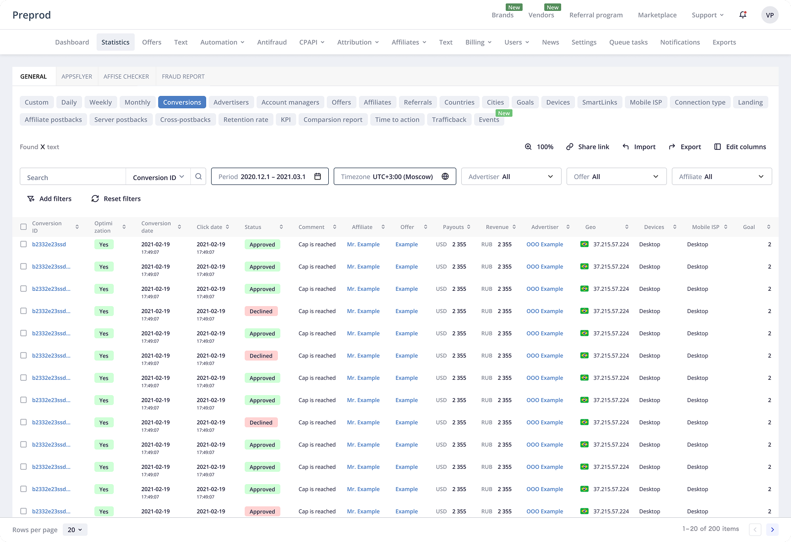
Affise is a B2B performance marketing analytics and attribution platform used by analysts, ops, growth teams, affiliate managers, and marketing teams to monitor campaign performance, conversions, traffic quality, revenue, and payouts. The Statistics section is one of the core parts of the product and a primary decision-making tool for most users. Over time, the section became overloaded with data, filters, presets, and configuration options, which made everyday analysis slower and reduced confidence in the new interface. The challenge was to make the Statistics workflow clearer, faster, and easier to trust without removing the depth that power users needed.

−60%
Back to Old Design usage
−35%
Report creation time
−30%
Support tickets related to statistics, reports, documents, and invoices
+22%
Task success rate for common reporting workflows
Role
Senior Product Designer
Domain
Performance Marketing / B2B SaaS
Platform
Web platform
Team
PM, engineers, analysts, QA, CS, CEO, CTO
Scope
Statistics redesign, workflow clarity, filters, reporting, documents & invoices
Affise dashboard

Product Context

A complex analytics product where clarity directly affects daily decisions

Affise helps performance marketing teams monitor traffic, conversions, revenue, payouts, and partner activity across multiple campaigns and offers.

For analysts, affiliate managers, ops, and growth teams, the Statistics section is not a secondary reporting area. It is a daily workspace for checking performance, comparing results, finding inconsistencies, exporting reports, and understanding what needs attention.

Because the product deals with dense data and frequent operational decisions, even small usability issues in tables, filters, presets, and reporting flows can create significant friction.

Affise product overview

The Statistics section is a daily workspace for analysts and ops teams working with dense campaign, traffic, and conversion data.


Core Product Screens

Statistics, reporting, and operational workflows


The Challenge

The Statistics section had the data, but the workflow had become too heavy

Users relied on Statistics every day, but the interface required too much effort to scan, filter, compare, and export the data they needed. Key metrics were difficult to read quickly. Filters and presets were complex and inconsistent. Reporting flows required too many adjustments. Users often switched back to the old interface because the redesigned experience had not yet earned enough trust.

Key issues

Hard-to-scan metrics
Important performance indicators were present, but the hierarchy did not help users understand what mattered first.
Complex filters and presets
Users had to spend too much effort configuring views before they could start analysis.
Reporting friction
Building and exporting reports required repeated adjustments and created unnecessary operational overhead.
Document and invoice confusion
Users needed clearer ways to find documents, filter invoices, and connect financial data back to analytics.

Goals

Improve clarity and readability
Make core metrics and tables easier to scan and compare in daily Statistics workflows.
Increase Statistics adoption
Reduce "Back to old design" usage by building a Statistics interface users would trust and prefer.
Reduce support load
Decrease tickets related to reports, filter configuration, documents, and invoice filtering.
Old Affise dashboard

The previous dashboard surfaced important data, but weak hierarchy made it harder to scan and act on.


Solution

Simplifying complexity without changing the workflow

The goal was not to make the interface visually lighter at the expense of functionality. Affise users needed detailed data and flexible configuration. The design work focused on making that complexity more structured, predictable, and easier to navigate.

⚠️ Problem1. Inconsistent UI across product sections

Different areas of the product had evolved separately over time. Statistics, reports, documents, and invoices used different layout logic, table patterns, filters, spacing, and visual hierarchy.

For users, this meant that every section had to be re-learned. Even familiar actions felt slightly different depending on where they were performed, which increased cognitive load and made the product feel less reliable.

Affise inconsistent UI example 1
Affise inconsistent UI example 2

Different product sections used different UI patterns, forcing users to re-orient themselves when moving between Statistics, reports, documents, and invoices.

✅ Solution 1. Consistency across data-heavy workflows

The redesign aligned patterns across statistics, reports, filters, documents, and invoices. This made the product feel more predictable and reduced the re-learning that was pushing users back to the old design.

UI consistency

Consistent patterns across Statistics, reports, and financial workflows made the product easier to trust.

⚠️ Problem 2.Filters took over the workspace

1. The Statistics page opened with several rows of filter fields shown by default. This took up almost half of the screen and significantly reduced the visible height of the data table — the area users actually needed for analysis.

2. Most of these filters were rarely used in everyday workflows, but they still occupied the primary workspace. Users had to work around the filter panel before they could focus on the data.

3. Filter settings were not preserved. After refreshing the page or logging in again, users lost their configuration and had to rebuild the same setup manually, which made repeated reporting tasks slower and more frustrating.

Workflow clarity

Several rows of default filters reduced the visible table area, while non-persistent settings forced users to rebuild the same views after refresh or login.

✅ Solution 2.Filter and preset improvements

1. I reduced the default filter area to a single fixed row with the most frequently used filters. This gave more vertical space back to the data table and made the Statistics page easier to scan from the first moment.

2. Less common filters were moved behind an “Add filters” action. Users could expand the panel only when they needed more specific configuration, instead of seeing every possible filter by default.

3. I changed the filter behavior so each user’s configuration was preserved between sessions. After logout, login, or page refresh, the panel stayed the way the user had last configured it, making recurring reporting workflows faster and more predictable.

Data scanning improvement

The redesigned filter panel kept the most-used controls visible, moved secondary filters into “Add filters,” and preserved each user’s setup between sessions.


Result Design

Statistics became easier to read and act on

The final experience gave users a clearer way to work with dense performance data. Key metrics became easier to scan, filters stayed predictable, and reporting flows required fewer repeated adjustments.

Instead of rebuilding context across disconnected views, users could move from overview to analysis, reporting, and financial documents with more confidence.

Affise redesigned dashboard

The redesigned Statistics workflow reduced reliance on the old interface and made daily analysis faster and more reliable.


Process

How I worked

01
Understand
Reviewed the Statistics workflow, recurring support issues, user behavior around "Back to old design," and the main points of friction in reporting and filtering.
02
Structure
Reworked information hierarchy, table readability, and the relationship between key metrics, detailed data, and reporting actions.
03
Simplify
Improved filter logic, presets, document discovery, and invoice filtering to reduce unnecessary steps in daily Statistics workflows.
04
Validate
Checked whether users could complete common Statistics and reporting tasks with less effort and fewer adjustments before delivery.
05
Deliver
Prepared high-fidelity designs, aligned components with the product system, and worked with PM, engineering, QA, analytics, CS, CEO, and CTO during implementation.
05
Iterate
Refined designs based on implementation feedback, post-launch adoption signals, and ongoing "Back to old design" usage patterns.

Results

Clearer statistics workflows improved adoption,
reporting efficiency, and support load

−60%
Back to Old Design usage
Clicks on "Back to old design" decreased after release, showing stronger confidence in the redesigned Statistics interface.
−35%
Report creation time
Average time to build and export reports decreased as users needed fewer filter adjustments before starting analysis.
−30%
Support tickets
Support tickets related to statistics configuration, report discrepancies, documents, and invoice filtering decreased.
Faster
Document discovery
Users were able to find documents and invoices with fewer errors and less clarification.
Clearer
Reporting confidence
Better alignment between analytics data and financial reports reduced confusion and helped users trust the workflow.
+22%
Task success rate
Users completed common Statistics and reporting tasks more reliably after hierarchy, filters, and workflow patterns were improved.

Reflection

In data-heavy B2B products, clarity starts with the user’s daily workflow

This project was not about making Affise simpler. Experienced users still needed the full depth of the product: detailed statistics, flexible filters, reports, documents, and invoices. The challenge was to understand how they actually worked every day — which views they opened repeatedly, which filters they used most often, and which settings they expected the product to remember.

A complex B2B interface should not force users to rebuild their workspace from scratch. It should support their habits and help them return to their own context faster. For Affise, this meant turning the filter panel into a more adaptive workspace: the most-used filters stayed visible, secondary filters moved behind “Add filters,” and each user’s configuration was preserved between sessions.

It also became clear that in data-heavy products, screen space is a product decision. The table was the main value of the page, so it needed to take up as much space as possible. Filters and settings had to become smaller, more focused, and more intentional — supporting analysis instead of pushing the data out of view.